Chinese Fonts
书法字体 Calligraphic Fonts
Click on any word to see more details.
Historic calligraphy works, especially inscriptions, are a good source for creating fonts. They can be traced and converted into graphics and font files. Chinese text can be written in several different script styles, including:
Oracle bone script 甲骨文
The earliest form of Chinese writing
Bronze script 金文
An early form of writing found on caldrons and other Bronze Age implements
Large Seal script or Great Seal script 大篆
Originated in the Western Zhou (1045—771 BCE). This is mostly used in signs, calligraphy, seals, and logos.Small seal script 小篆
The form of Chinese character standardized by the Qin Dynasty (221—207 BCE).Regular script 楷书
This is the most common form of script seen today. It is the most readable style of script and the basis for all commonly used fonts, including Song Hei type faces, intended for composition and display of Chinese text. It appeared in the Cao Wei dynasty (220—265).Clerical script 隶书
This is an older style of script similar to regular script but wider and more square with more isolated strokes. It is commonly used today for headers, logos, and shop front signs.Cursive script 草书
Cursive script is difficult to read and mostly used in signs, calligraphy, and logos.Semi-cursive script 行书
A partially cursive style of writing. It has the flavor of cursive writing but is easier to read.Calligraphy students may progress in three stages: tracing or copying, immitating, and creating. In the first stage students will trace or copy to master the basic techniques. In the second stage students will imitate good role models and accumulate a repertoire of characters. Finally, having mastered the basic techniques and established a sufficient repertoire of characters calligraphers can create their own works in their own unique styles. Needing to draw characters that are not in templates or calligraphic dictionaries a calligrapher will need to find similar characters with the required radicals. For digital art, a similar process can apply: learning basic techniques, immitating to establish a repertoire, and then creating one's own unique works. In digital art, one can directly copy from one's repertoire.
楷书 Regular Script
Great calligraphy masters from the Tang and Song dynasties laid the foundation for styles most commonly used today. The four great masters of regular script 楷书四大家 are Yan Zhenqing 颜真卿 (709-785), Ouyang Xun 欧阳询 (557-641), Liu Gongquan 柳公权 (778-865), and Zhao Mengfu 赵孟頫 (1254-1322).
颜真卿 Yan Zhenqing
The style developed by Yan Zhenqing 颜真卿, called Yan style 颜体, is one of the great figures in Chinese calligraphy and is the style learned by most beginning calligraphy students. Yan Zhenqing was born in the Tang capital Jingzhao, present day Xi'an in Shaanxi province. He came from a family of scholars and a number of members of the Yan clan had worked in the imperial court. He passed the highest imperial civil service examination and worked as a Tang court official and imperial tutor.
Yan style borrows some elements of clerical and seal script styles, being relatively wide with more isolated strokes. It invariable has thin horizontal and thick vertical strokes with rounded endings. The curvature of the right-most vertical 竖 and vertical hooked strokes 竖 is exaggerated. Many of the horizontal strokes are leaning. Long horizontal strokes are usually thin in the center and thick at the ends. The stroke turns of horizontal and down strokes like ta jian zhe 塌肩折 are unique. In groups of similar strokes Yan style varies thickness and turns in a unique way. According to conventional use in the Tang dynasty, Yan Zhenqing uses a number of character variants that are not used today. In addition, in some cases, he uses the same forms as simplified Chinese, where one might expect a traditional variant. In fact, simplified Chinese characters, although not standardized until the 1950's and 1960's, uses some variants that were in existence in previous historic times. This is also the reason that Japanese text has a number of simplified characters.
Yan Zhenqing was a prolific calligrapher, which is another good reason to study his works — coverage. His earliest work is Yanta Timing 《雁塔题名》 . His best known work is Duo Bao Ta Gan Ying Bei 《多宝塔感应碑》. A well known work written during his middle years that Yan Zhenqing was proud of is Dongfang Shuo Hua Zan 《东方朔画赞》. Two of his works in semi-cursive script are 《祭侄文稿》, written in memory of Yan Zhenqing's nephew who was tragically killed, and his later work Zheng Zuo Wei Tie 《争座位贴》.
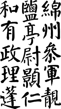
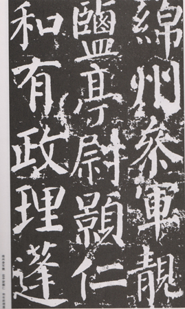
Despite Yan Zhenqing's large number of works, you will likely find, however, that the number of characters in historic inscriptions is not sufficient to form a complete font. For example, the Yan Family Ceremonial Inscription 颜勤礼碑, a well known inscription from Yan Zhenqing in his later period has around 1667 characters total (with considerable repetition of characters). You will have to fill in the remaining characters from the glyphs developed and your knowledge of calligraphy. Working with a vector format is important for this because of the ease of transforming and reusing. The figure below is traced from a section of of the Yan Family Ceremonial Inscription. Note that the text is written top to bottom, right to left.


Yan style inspired many people and was widely studied. The first well known calligrapher to adopt a Yan style was Liu Gongquan 柳公权 (778—865). Later Yang Ningshi 杨凝式 (873—954) adopted a Yan style. In the Song Dyansty (960—1279) Yan Zhenqing became a widely recognized model for calligraphy and was very influential on the four famous Song calligraphers 宋四家, Su Shi 苏轼 (Song Dongpo), Huang Tingjian 黄庭坚, Mi Fei 米芾, and Cai Xiang 蔡襄. In the Yuan and Ming dynasties Zhao Mengfu 赵孟頫 and Li Dongyang 李东阳 were greatly influenced by Yan Zhenqing. In the Qing Dynasty Sheng Zhuanshuai 盛转衰 was a pioneer in using tracings to analyze the and style and authenticity of Yan Zhenqing works. Liu Yong 刘墉, He Shaoji 何绍基, and Weng Tonghe 翁同龢 were influenced by Yan Zhenqing.
See the book Yan Zhen Qing: Yan Qin Ceremony Inscription [Zhan Weixin 2007] and the article Introduction to Calligraphy on this site for more details on the basics of calligraphy, Yan style, and Yan Zhenqing. See the page Yan Family Ceremonial Inscription on this site and the book Yan Family Ceremonial Inscription: Calligraphy Skills Lecture Series [Bitian Jingnangu 2004] for partial text of the Yan Family Ceremony Inscription and the external web page Yan Zhenqing (709-785) Calligraphy Examples [China Page] for the full text. See the book Yan Zhenqing [Li Yi 2007] for more about the life and works of Yan Zhenqing.
草书和行书 Cursive and Semi-Cursive Script
One of the early pioneers of Chinese calligraphy was Wang Xizhi 王羲之 (303—361), who lived in the Eastern Jin. He was especially known for his semi-cursive script.
章法 Composition
The most common kinds of traditional compositions include the wall scroll 条幅, works for the center of a large hall 中堂, couplets 对联, horizontal inscribed board 匾额, a horizontal hanging scroll 横披, album 册页, and fan 扇面. These all can make interesting backgrounds for digital graphic designs featuring calligraphic text.
Wall scrolls may come in individually or in a set 屏条. The couplet 对联 composition originated in the Ming. They can be three characters 三言, five characters 五言, seven characters 七言, or longer. In horizontal scrolls text flows from right to left. This tradition continues today in many modern signs, especially neon signs for shopfronts. Text describing the origin of a calligraphic work 落款, including calligrapher's name and reason for writing it, is placed at the left. Horizontal inscribed board 匾额 are usually placed in temples, park pavillions, class rooms, or studios. An album 册页 style usually folds out into a long horizontal work comparable with a horizontal scroll.
Arranging the areas of ink and white space is also important in composition. In most cases, the characters will be read vertically and may or may not form a grid depending on the alignment of the characters horizontallly. Traditionally, calligraphers try to avoid having all the characters the same size and aligned in a grid since it feels too stiff. This is hard to avoid in computer fonts but the stiffness of Song and Hei fonts is one of the reasons that people turn to calligraphic and artistic fonts.
Seals are also an important part of calligraphic works. Seals can be classified as personal seals 名字印, official seals 官印, and unofficial seals with a well known saying or a quote from a poem 闲章.
Dictionary cache status: not loaded